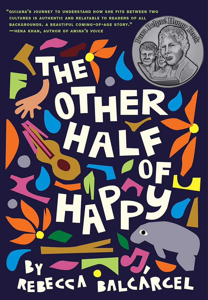
As a designer and aspiring author, I think a lot about book covers. I daydream about my future covers, all the while knowing I may have little say in how they turn out. Reading for research, pleasure, and before bed with my kids, I take note of designs I appreciate.
These days, many middle grade books follow the same formula of an illustrated main character either facing the viewer head on or appearing in profile. The following books stand out for breaking that mold.
Below are five trends I’ve spotted from middle grade book covers released in 2023. I have not read the majority of these books (yet) but they stood out to me because of a specific design element I like.
Where available, I’ve given credit to the book cover illustrator or designer.
[Disclosure: I am an affiliate of Bookshop.org and I will earn a commission if you click through and make a purchase.]
1. Abstraction
The covers above showcase their titles front and center amid an abstraction of other images. Whether it’s organic shapes reminiscent of Matisse’s cut paper works, stylized dishes awaiting their close-up, or illustrated “windows to the soul,” each of these covers grabbed my attention.
2. Focal Point
As a photographer, I often employ “The Rule of Thirds,” a compositional choice to place the focal point of an image in the left-most or right-most third and not exactly centered. It’s a technique to draw the eye to the subject while also including some context within the composition. The artists who created these covers skillfully made their protagonists stand out by drawing the viewer’s eyes to them within their environments.
A full moon acts as a spotlight in The Night Animals, the main character in Barely Floating‘s streamlined arms complete the five-pointed star with her at the center, and all trees point to the protagonist in Sky Ropes, drawing the viewer’s eyes to the sky.
As a former ropes instructor (Go Vega Stars!), I would be remiss if I didn’t mention the lack of a harness, helmet, or belay system but I’ll let it slide since it’s an illustration.
3. Pastel & Backward Facing
I’ve heard more than a few readers complain about how a beloved character has been portrayed on a book cover. I imagine it’s a daunting task for an artist who must interpret the character’s appearance solely from the text. That’s one of the reasons I am drawn to (no pun intended) these covers. Each gives us a glimpse of the protagonists be they human, feline, or canine, by showing them from behind, leaving much to the reader’s imagination.
In addition, each of these covers along with the next three, utilize a pastel palette, which makes me nostalgic for some of my 1990s wardrobe. Hypercolor t-shirts anyone?
4. Pastel & Organic Illustration
In addition to a similar cool pastel palette, each of the above highlights a distinct illustration style and I’m here for it.
5. Framing
One of my favorite first year photography assignments in high school was to create a composition using a frame from the built or natural environment. Architecture works well for this—think archways, windows, and stairwells. These three covers utilize this approach to maximum effect with a museum, a little free library, and a bathroom stall framing each book’s title and protagonist.


