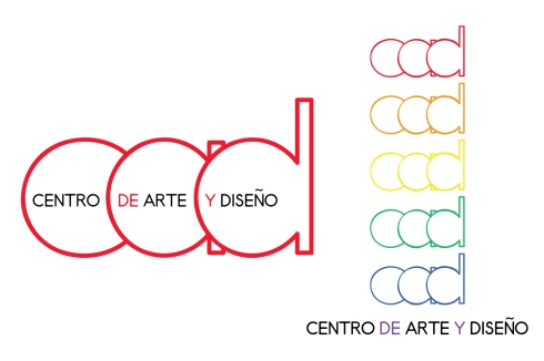
Above is the logo for the new Palmar Centro de Arte y Diseño. On the right is a mock-up of a sticker we are making to give out for the Grand Opening this weekend. The sticker has a fun, 70s/80s feeling that works with the idea of an art center for kids and teens. Here’s the story of how I got to this final product.

I started off with the concept of repeating shapes – Century Gothic is a great font for repetition of circles and to exploit that point I even included the “d” of “de” in the first pass. I had no illusions that I could just stop there, so after some playing, I came up with this:

Still using the ideas of the shapes of the letters I outlined and intersected them. I also played around with several different fonts and added a drop shadow to add some depth to what was looking to me like a flat design. I liked that it was architectural but it seemed too cold and structural for an art center for kids and teens. Plus, I wasn’t sold on all of the lines being visible.

After playing around with lots of ideas that just seemed too trite to me, I came back to this one. I took out the straight vertical lines that once intersected but it took another try for me to get rid of the first “d” to get this:

I was drawn (no pun intended) to the simplicity of these shapes and I liked how it looked with just three letters, rounded edges, and a thicker stroke to the line. But something still seemed missing.

I found AR Techni font on Dafont.com – one of my favorite sources of inspiration for fonts – and played around with reflecting the three letters and creating a gradient technique to add depth. I still really like this idea but it just doesn’t read young enough to me. If the building was art deco and the center catered to adults…maybe. So, I reeled it back in and came up with this:

I think we’ll still use this one as an alternative logo for some projects. It’s fun, it’s youthful, and like the Mtv logo, its simple outline can be filled in by different students as part of a future project. My last inspiration, which came from the television show Once Upon A Time (google the title and you’ll see what I mean) was to have the words read inside of the letters.
